
About This Holiday Lighting Guide
Prepared by: Holiday Illumination Christmas Light Installation
Last updated: September 3, 2026
Quick Answer
Warm white vs multicolor Christmas lights is a design decision, not a ranking of which color is better. Warm white often emphasizes architecture and creates a classic look, while multicolor can create a more playful, energetic display that stands out across rooflines and landscape elements.
The strongest choice is the one that fits the exterior colors, roof shape, landscaping, neighborhood context, and the feeling the household wants after dark. A coordinated plan matters more than simply choosing one color family.
Key Takeaways
- Start with the architecture and exterior colors. Look at siding, brick, stone, trim, roof color, columns, and the shape of the roofline. Warm white can create a clean outline, while multicolor can be used more…
- Choose a primary color strategy before adding accents. A display feels more intentional when the roofline, trees, wreaths, walkways, and landscape elements follow a clear color plan. Decide whether the roofline is the anchor and whether…
- Evaluate the display from the real viewing distance. Colors that look balanced from the driveway can read differently from the street. Consider the main approach to the home, neighboring light levels, trees, and other visual elements…
- Use mixed color only when there is a deliberate pattern. A combination of warm white and color can work when each has a job—for example, a consistent roofline with colored tree or landscape accents. Random mixing without a…
Warm White Creates a Classic Architectural Look
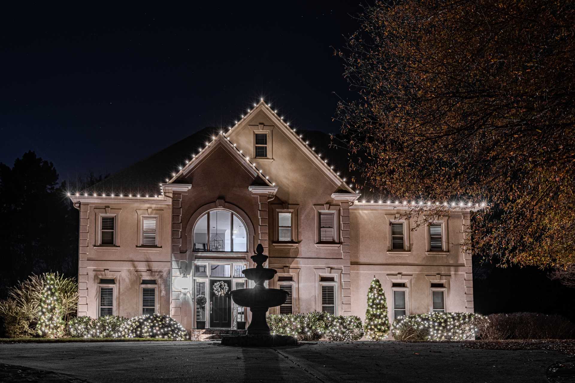
Warm white lighting is often chosen when the goal is to emphasize the shape of a home, create a traditional holiday appearance, or keep rooflines, wreaths, columns, and landscape details visually consistent. It can work especially well when the architecture itself is the main feature of the display.
Multicolor Creates a More Playful Display
Multicolor lighting can make a display feel more energetic and family-focused. It can be used across rooflines or as an accent on trees, shrubs, pathways, and other exterior features. The strongest results still use a deliberate color plan rather than mixing every available option without a clear pattern.
Choose Based on the Property, Not a Trend
Consider the exterior colors, roof shape, landscaping, neighborhood setting, visibility from the street, and whether the display should feel formal, traditional, playful, or bold. A property-specific design can also combine warm white architectural lines with selected color accents when that fits the home.
Step-by-Step Planning Framework
Start with the architecture and exterior colors
Look at siding, brick, stone, trim, roof color, columns, and the shape of the roofline. Warm white can create a clean outline, while multicolor can be used more deliberately when the property can support stronger visual contrast.
Choose a primary color strategy before adding accents
A display feels more intentional when the roofline, trees, wreaths, walkways, and landscape elements follow a clear color plan. Decide whether the roofline is the anchor and whether secondary features should match or contrast.
Evaluate the display from the real viewing distance
Colors that look balanced from the driveway can read differently from the street. Consider the main approach to the home, neighboring light levels, trees, and other visual elements that can affect how bright or busy the final display appears.
Use mixed color only when there is a deliberate pattern
A combination of warm white and color can work when each has a job—for example, a consistent roofline with colored tree or landscape accents. Random mixing without a pattern can make the display feel less organized.
Common Mistakes to Avoid
- Choosing colors without considering the exterior materials and roofline shape.
- Using several unrelated color patterns on the same property without a visual hierarchy.
- Judging the design only from close range instead of the street and normal arrival path.
- Adding so many accent areas that the strongest architectural features lose emphasis.
The purpose of this checklist is to make the scope clearer before installation. It also makes estimates easier to compare because design, access, service, removal, and property constraints are documented instead of assumed.
Frequently Asked Questions
Is warm white more traditional for Christmas lights?
Warm white is commonly associated with a classic architectural holiday look and can create a consistent outline across rooflines, columns, wreaths, and landscape features.
Can multicolor still look professional?
Yes. Multicolor lighting can look deliberate and polished when the colors follow a consistent pattern and the design has clear primary and secondary areas.
Can warm white and multicolor be used together?
Yes. One approach is to keep the roofline consistent and use color as an accent on trees, shrubs, walkways, or selected architectural features.
How do I decide which color scheme fits my home?
Review the exterior colors, architecture, landscaping, desired mood, and the main nighttime viewing angle. Photos of the property can help during the design discussion.
Related Holiday Lighting Services & Resources
Residential · Outdoor Lighting · Projects · Christmas Light Installation Atlanta · Holiday Lighting Resources · Request a Free Estimate
Plan the Next Step for Your Property
Use this guide to narrow the design, timing, access, and seasonal-service questions that matter for your property. When you are ready, request a property-specific estimate so Holiday Illumination can confirm the exact scope, availability, installation requirements, in-season support, takedown, and storage options that apply to the address.